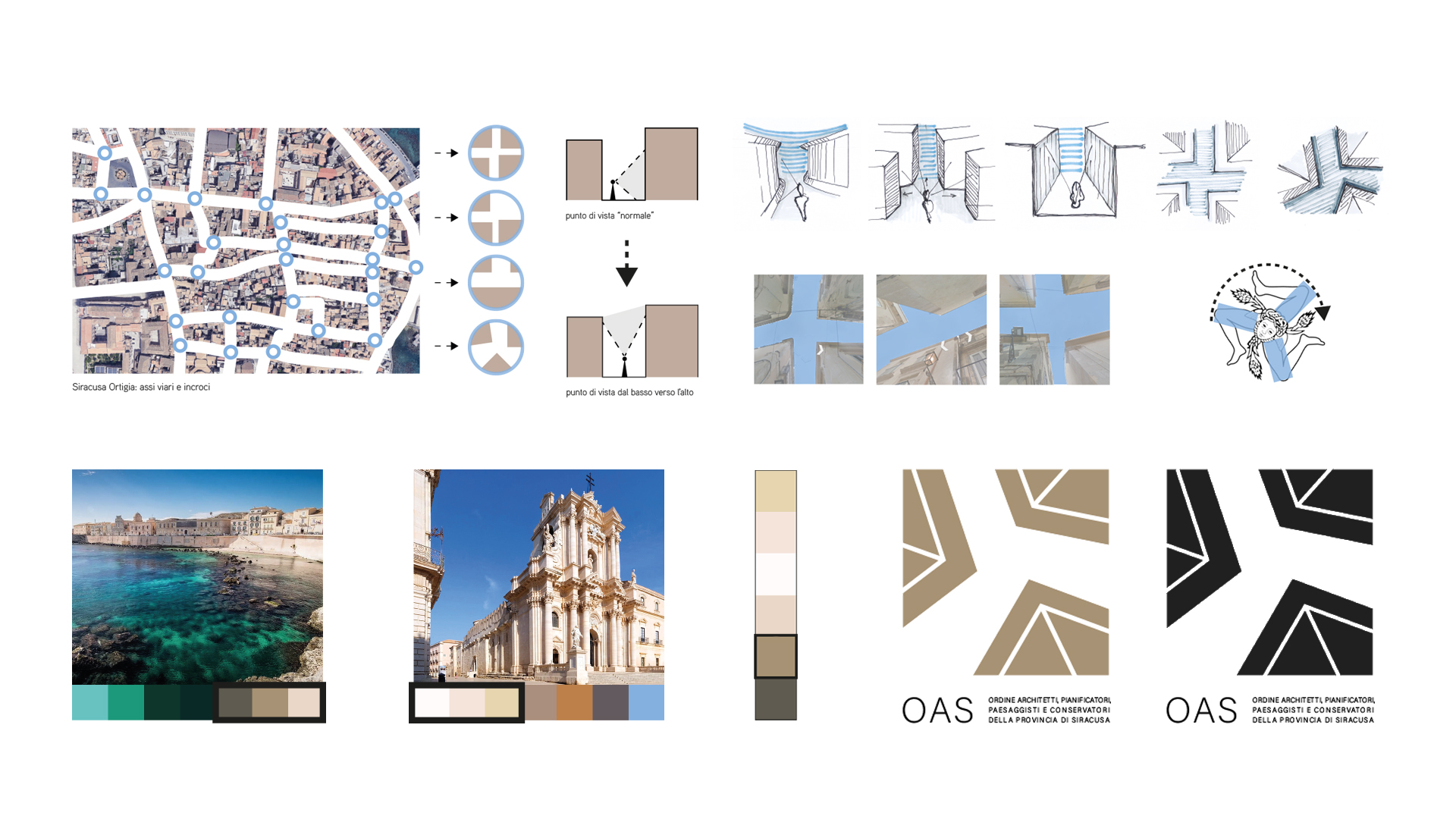
The place and the sign are essential elements to each other, the creative process that led to the idea of the proposal was developed from a careful and refined analysis of the city of Rome.
It is suggested by Paolo Portoghesi in the text "Roma Interrotta" of 1978), in which the architect highlights the similarities between the physical and urban environment.
Therefore, this method of analysis of the signs of Syracuse, of Ortigia specifically,
with an analysis of the road axes and their intersections were applied, often characterized by strong compressions given by the proximity of the built.
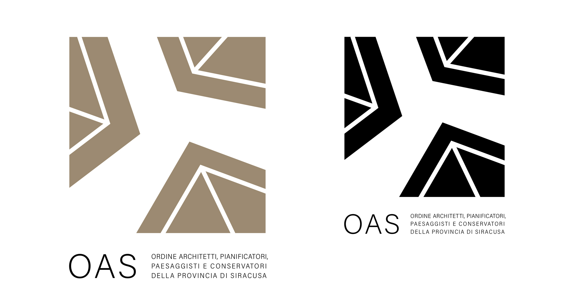
It is precisely this feature that has created the logo, with the peculiarity of changing the point of view, moving it from the man-height upwards, where the roofs merge with the sky of Syracuse, where they outline edges and geometries never banal with graceful asymmetries and strong color contrasts.
This creative idea seemed correct to summarize the Order’s link with the territory and its history but also looks to the future with a strong sense of dynamism and strength.
Competition
Client: Ordine Architetti Siracusa
Date: 2022
Program: graphic design
Architects: Riccardo Nemeth